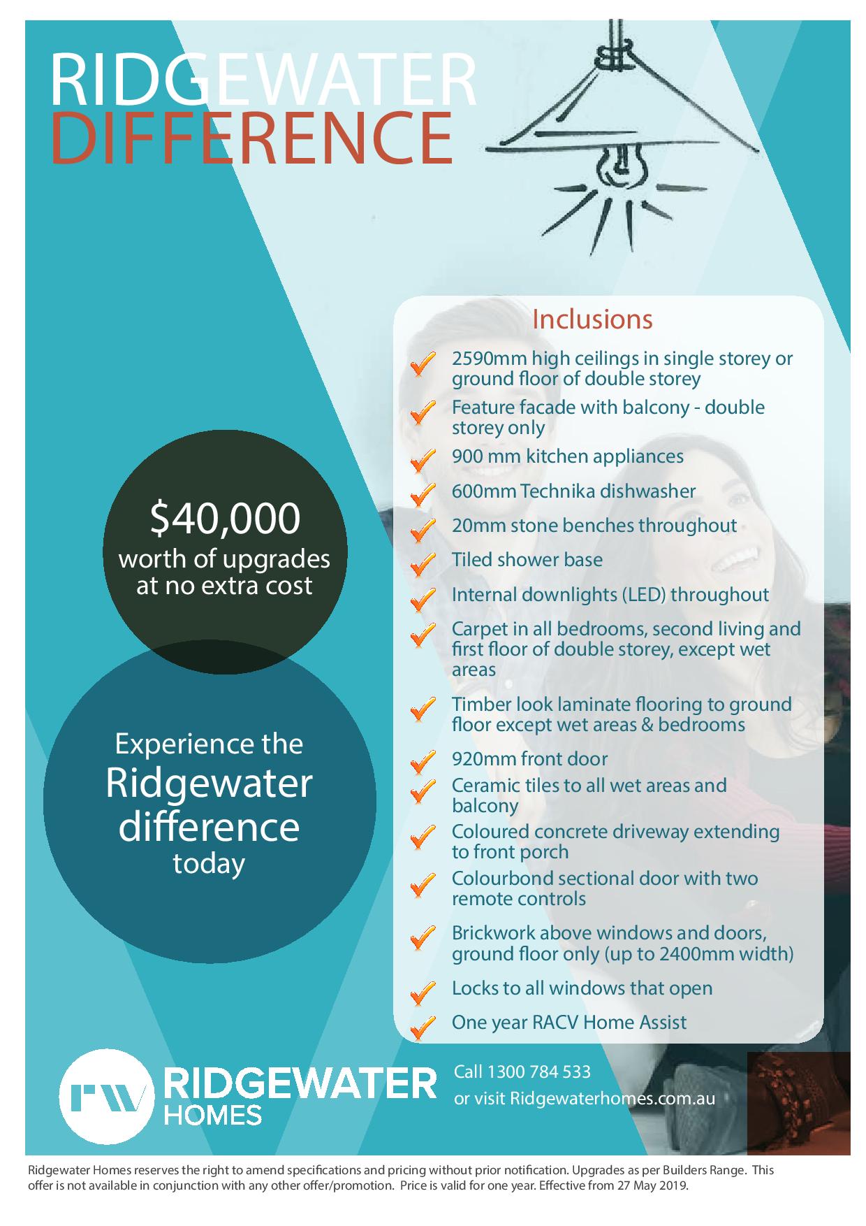
Home Interior paint colour Trends for 2022
Stylish trendy Gray
In the last few years, Hampton’s style which uses grey has become extremely popular for home interiors. Since gray is a neutral colour, it can be used with any accessory or furniture. Additionally, the right gray paint will complement the white skirting and decor well. There are different shades of gray available which differ in the undertones, warm or cool. The cooler shades of gray will reflect more blue light, so different colour strengths may have to be combined to get the right shade. These shades are recommended for modern home decor systems which use natural lighting, they make the home look bigger in size. There are more options for warm grays which are a mixture of beige with cool gray and called ‘greige’. They are widely used in Hampton homes for a traditional cosy feeling.
A colour consultant can help you find the right colours for your home, to create the cool or warm ambience required. The grays should be combined with other colours for a homely look, so they should be used with stone, and timber in furniture, fireplaces, and floorboards.
White
White is a popular colour because it symbolizes purity, simplicity and matches all decor. Increasingly homeowners who wish to recreate a resort-style ambience prefer white. There are many shades of white and each shade has an underlying colour. The window placement, room size, and amount of light entering the room should be considered while choosing a suitable white undertone. For minimalist or modern decor, cool white with a green or blue undertone is recommended, since it will help in making the room look larger, reduce the effect of very bright light and not dazzle the eye. They are suitable for homes with a coastal decor style. The colour may look different in the ceilings, walls, rooms and other areas of the home, based on the lighting, so it is advisable to check the colour, by painting a small sample area. Warmer white colours have a pink, peach or yellow undertone, and are recommended for rooms facing the south, for the illumination they provide, homes with classic decor styles or less natural light.
Dark
In the last year, dark interiors have become very popular and this trend is expected to continue. In addition to conventional black and grays, lake green, brown, inky blues and charcoal shades are also popular dark colours which make a room look grand and warm. The same dark tone should be used on all walls, warmer tones make the room vibrant, while cooler tones give a quiet feel to the room. Lighter-coloured furniture like dining tables, and beds are more visible if dark paint is used. White or gray accents should be used in these rooms. If you do not want a completely dark room, you can use a feature colour. Homeowners can start using dark paints in their media room since it blocks light reflection, for better quality images from projectors or TVs. Since imperfections are more easily visible in dark walls, it is advisable to invest in quality paints and better wall preparation
Tips
It is advisable to limit the number of colours used for painting the home, and ensure that they have the same undertone, either warm or cool, to give the home a uniform look.